We recently discussed some open-source alternatives to Google Chrome, or rather Chromium and its derivatives. Most of those browsers were not very great on features and were somewhat minimalistic. Min takes minimalism to the next level and it works and doesn’t. At first glance, it seems Min doesn’t even support tabs but it does. You have to guess where the address bar would be because it’s unclear. Remember the first time you ditched the cluttered Internet Explorer or Firefox UI for Chrome? Multiply that feeling by a factor of 10. So yes, even though Min is a minimalist open-source web browser, it can be overwhelming at first.
Tab grouping
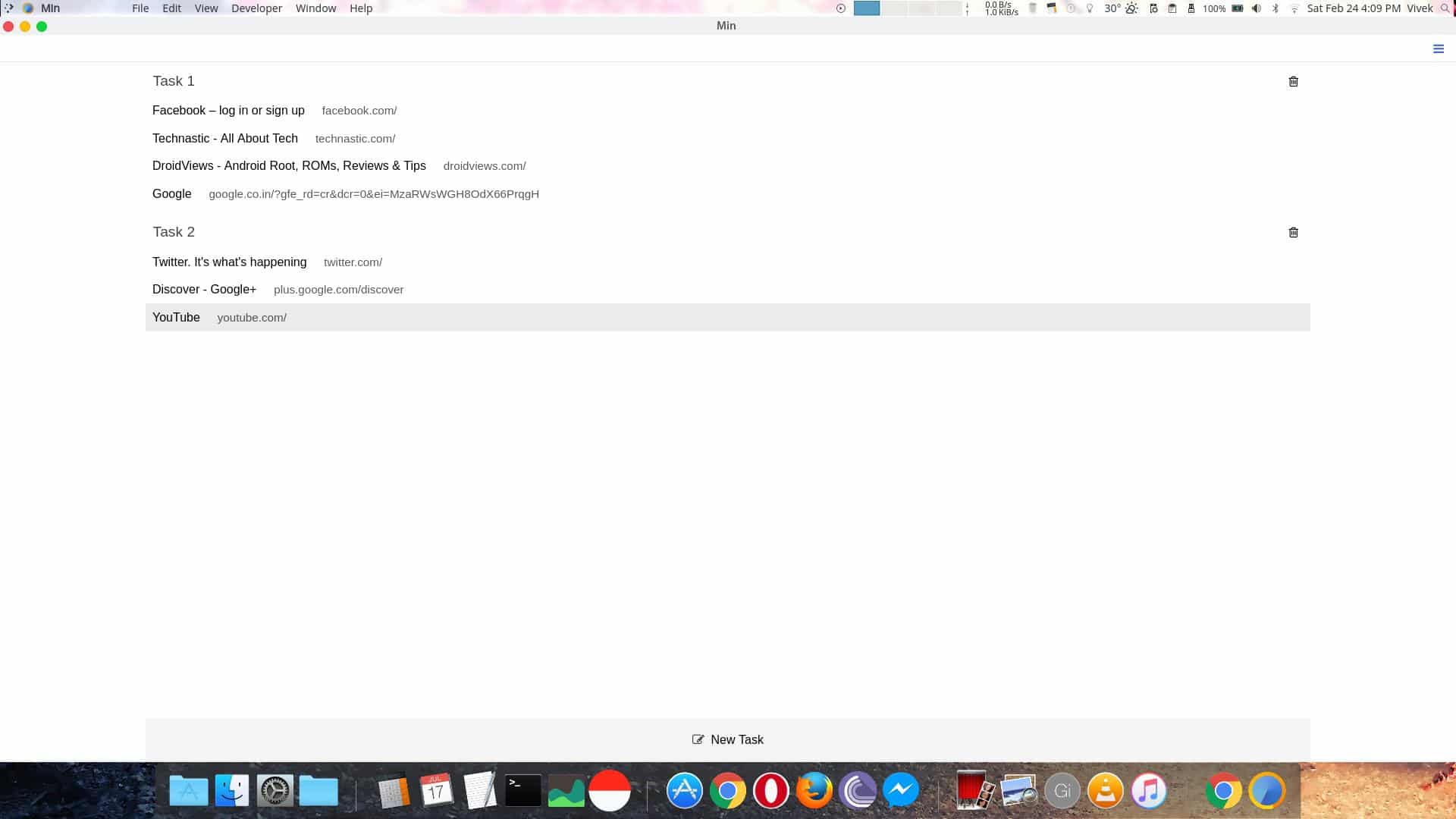
Min is written in Javascript and CSS as it uses Electron. For the uninitiated, Electron is a framework used to build native cross-platform desktop apps using Javascript, HTML, and CSS. The browser focuses on a clean, minimalist browsing experience and it manages that quite efficiently. It may be a minimalist web browser but it does pack in enough features that you probably won’t miss your current browser a lot. Then it brings in a feature you may not have heard of before, tab grouping. Min lets you group several tabs so you have one group of tabs visible. It’s a feature you may not care about, until you get used to it, like virtual desktops.
Tabs
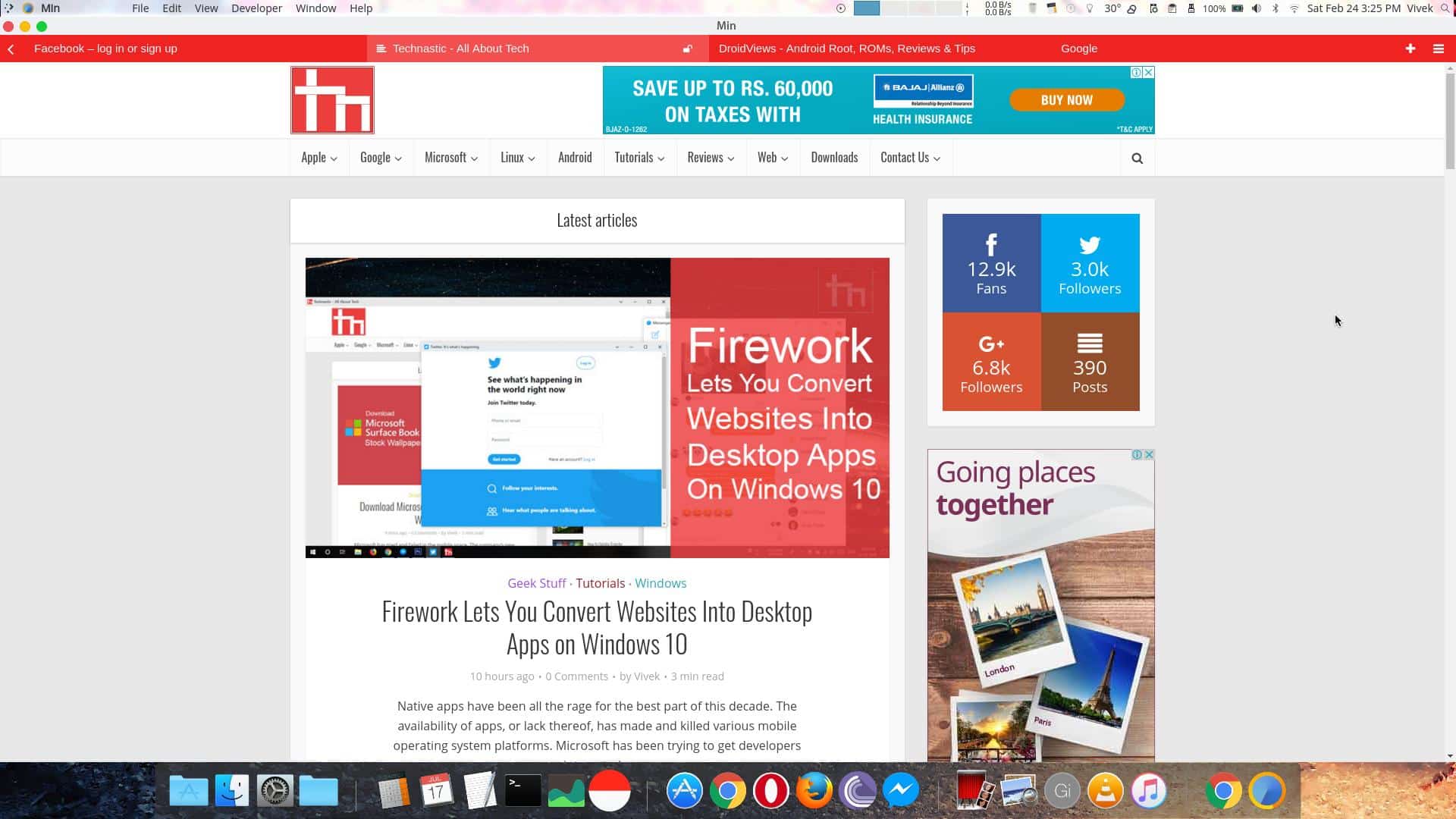
The address bar is right where the tab title is, and you’d have to click on it to make it appear. Multiple open tabs have never looked as minimal and they’re less distractive. That may not be a good thing for everyone. What everyone will appreciate though is how the tab bar changes colors based on the website, quite like Chrome on Android. That does not help functionality much but it does look cool.
Furthermore, if you click on View in the menu bar, you can enable a Focus mode that hides every other open tab except for the current tab. This is again meant to make the browsing less distractive. I like how tabs open next to each other, taking up an equal amount of space and filling the entire width. This makes it easier to switch when you only have about 3 or 4 tabs open.
Search
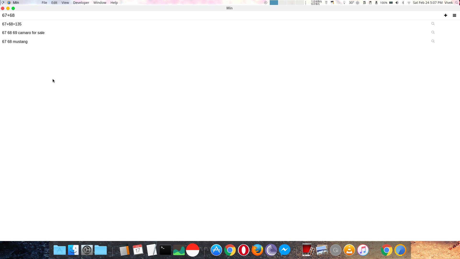
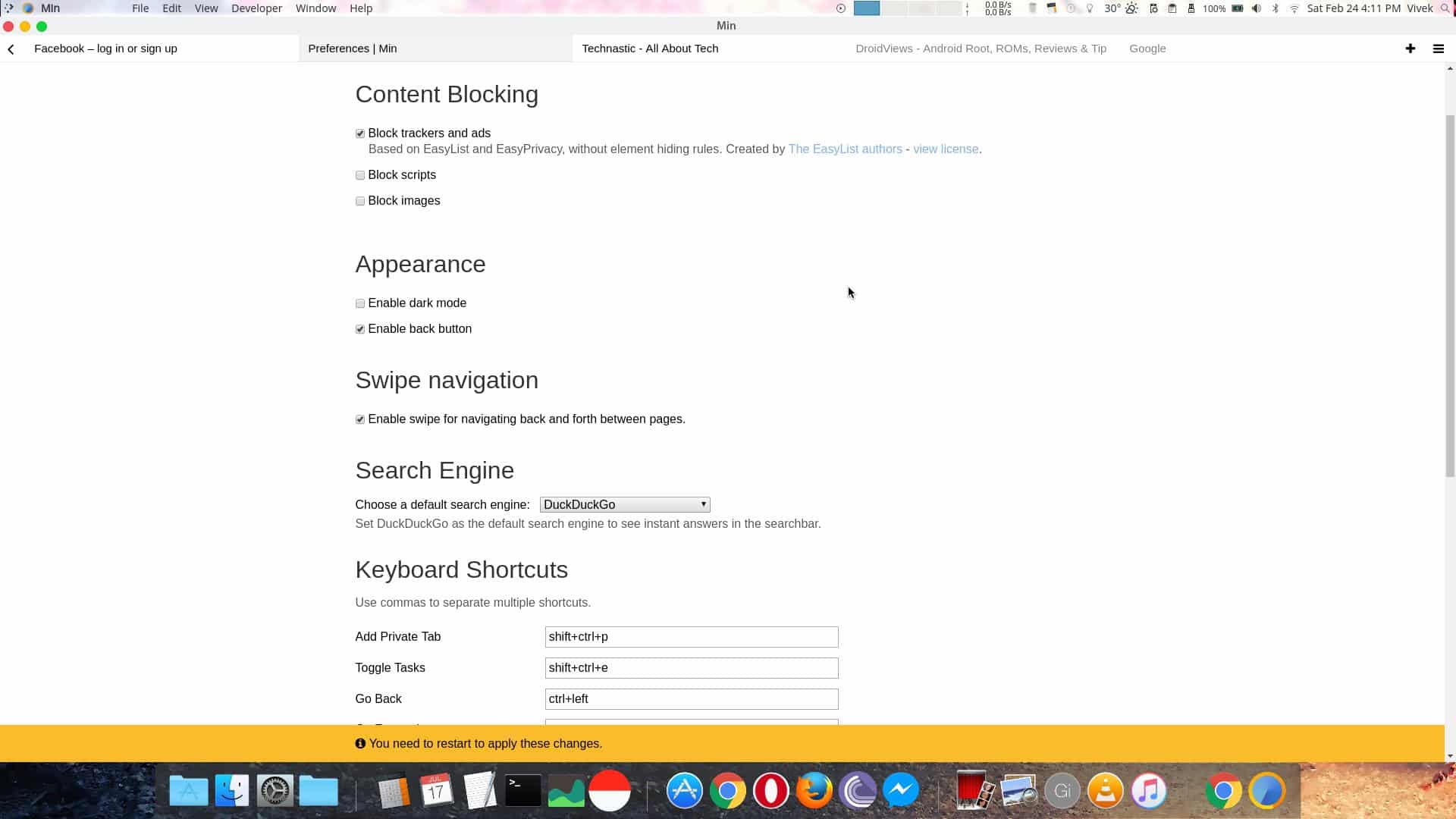
The default search engine on Min is DuckDuck Go but it lets you change this in Edit > Preferences. The list includes DuckDuckGo, Google, Bing, Yahoo, Baidu, Wikipedia, and Yandex. You may prefer Google, but Min prefers DuckDuckGo and thus provides a little extra functionality when it’s set as the default search engine. For instance, it can calculate things for you. You can even search browser settings even, type “!” before your query. 
The browser also has a dark theme for night-time browsing and the fans of a darker interface. There is a built-in ad-blocker, a script blocker, and an image blocker if you’re running low on data. You can also set several keyboard shortcuts for each action, which can make navigation even faster.
Not quite as polished
Don’t be fooled by the fancier-looking UI. Min may seem like a well-designed browser, and it is but it isn’t perfect. I couldn’t right-click on the address bar to copy or paste anything. You have to depend on the keyboard shortcuts if you want to do that. you cannot just type the name of a website and hit Ctrl+Enter since it doesn’t do anything. Right-click any empty area on a page and you’ll soon realize you can’t even save a web page. If you change as much as the default search engine, you’d have to restart the entire browser. That is not an ideal situation.
Final words
Min didn’t set out to be an alternative to the feature-packed heavy-weights such as Chrome or Firefox, it can’t be. It focuses on minimalism and despite being made using Electron is quite light-weight. Some of its issues, though not major, are hard to ignore. Basic features, like a decent right-click context menu, are expected out of a web browser no matter how minimal it is. Min tries something new and it is unique. If you use it in front of someone they are at least going to be curious about which browser you’re using. If you can ignore the glaring mistakes, do give Min a try.
Read Next: 5 Best App Launchers for Linux

