Since Windows 10 has arrived, Microsoft has been pushing to update the operating system’s design to something that looks more modern. However, Windows is huge, and it’s the only operating system that ensures backward compatibility. Programs made for Windows 95 can still run on Windows 10 today. This results in a mess where a lot of Windows apps, even first-party apps follow different design languages from different eras.
The File Explorer app on Windows 10 is a good example. Users have been waiting for a better-looking, modern fluent design file explorer app for Windows 10 for a long time. Files is undoubtedly the best model file manager for Windows 10 and one of the best file explorer alternatives to check out.
The demand has been big enough that some third-party developers have decided to take matters into their own hands. Today there are a few Files apps for Windows 10 that follow modern design standards. However, none is close to replacing the default file explorer app on Windows 10. That’s because these fluent design file explorer apps are rather nascent, lacking features, and sometimes even unstable. They’re nice to look at but not fun to use.
Files – an enthusiast’s take on what a modern file explorer should be

Files, a new fluent design-based file explorer app by Yair Aichenbaum is possibly the best iteration of a modern files app for Windows 10. The app also has a great community behind it lending direct development support (Thank you winston-de for the correct info). It’s a rather generic name that does not do much to differentiate the app from any other similar apps. However, it’s probably not supposed to.
Design
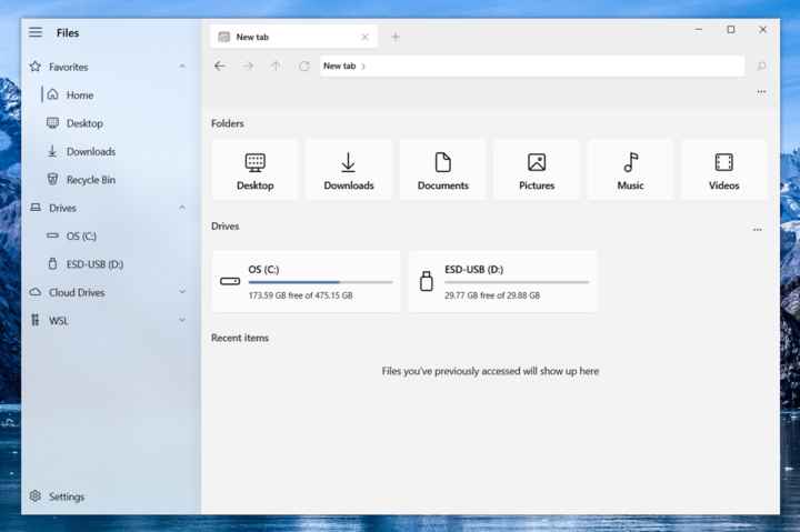
Files is one of the best modern file explorers for Windows. It tries not to stand out as a third-party app but seems integrated into Windows 10 as a default Windows 10 app. It looks more like a Windows 10 file explorer than the default file explorer app we get with Windows 10. The navigation column on the left is translucent with a blur, just like any other modern Windows 10 app such as the Settings app. The Files app uses monochrome iconography on the home page. It looks good, but monochrome icons are a bit outdated now and even Microsoft has switched to more colorful icons for the OS. Other than that I don’t have many complaints about the design.
Don’t Miss: How to Clean and Customize Windows 10 Context Menu
Functionality
Windows 10’s file explorer not only looks old but also lacks features especially when you compare it to other file managers on and off the platform. Tabs in the file explorer has been a feature that people have been demanding since Windows 7. This new fluent design Files app does have tabs, but also has a dual pane feature. This divides the explorer window into two panes which allows browsing different folders at once and easily moving files between them. Normally, you’d have to open separate file explorer windows side by side to do that. In case you prefer to use the default file manager, don’t forget to check out these Windows File Explorer shortcuts to make the most out of it.

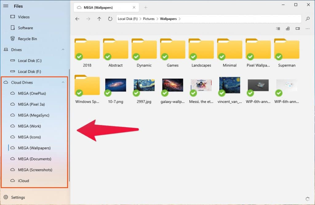
It also lists all your cloud folders in a collapsible menu item in the left column, making them much easier to access. Basic functionalities such as cut, copy, paste, etc. are supported. However, drag and drop can be a little annoying. You can only drag and drop a file that has already been selected. This introduces an additional click in the process. So, you have to first click the file or folder to select, and then you can drag and drop it. Other than Tabs, the best feature of the app is that it opens exactly where you close it. All your tabs are preserved as well unless you close them manually.
Layout

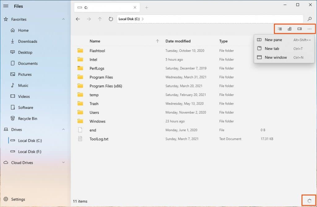
It supports the breadcrumb navigation, but you can also click on it and enter a specific location via your keyboard. There aren’t many buttons due to the clean design. You get a three-dot menu button for opening a new tab, pane, or window. Then you also have a button to toggle the preview pane, a button to switch between different view modes such as grid, list, etc., and a button to select all files, invert the selection, or clear selection.
There is a button in the bottom-right corner that lets you see ongoing tasks such as files being copied or moved. The appearance can be customized further in the Settings, found at the bottom of the left corner. The acrylic sidebar has to be enabled in Settings because it’s disabled by default.
Performance
This is where the app loses all the points gained before. As mentioned before, most of these new projects are in nascent stages. This modern, fluent design-based Files app suffers from that too. It gets the job done, but it’s just not very reliable. There have been times when it has crashed on me, but that’s not all. The app is slow even when reading from an SSD. Displaying the contents of a folder after it has been double-clicked takes almost a second sometimes.
I love that it saves the app’s status when it is closed and resumes right from where you left off. All the tabs and open folders are right there when the app is launched. However, because the performance is not quite up to the mark, the more tabs you open the slower the app launches. Switching between the tabs is also not instantaneous as it takes a second. The same is true when you right-click on something. It takes half a second for the app to react, and then half a second for the animation which I appreciate. Although to be fair, blurred context menus behave the same way across the OS, so this might not be the app’s fault.
That button in the bottom-right corner that is supposed to show users the status of ongoing tasks? Doesn’t quite work either. It doesn’t give you real-time information about the process. This seems like a bug, but it only shows you that file transfer is in progress at 0%, and then it shows you that it is complete at 100%. This happens regardless of the time it takes for the process to complete. However, Files does not let you auto-arrange files as Windows file explorer does as of now.
Is this Modern, Fluent Design-based Files app usable?
If you’re not someone who needs to get things done very quickly, then the app is usable. Right now, it’s a great app for your parents or grandparents who might not be in a hurry. It can be used by people who take their time clicking things. The app does get very regular updates though and new features are being added as well as bugs and issues fixed. Hopefully, the performance issues won’t remain around for long.